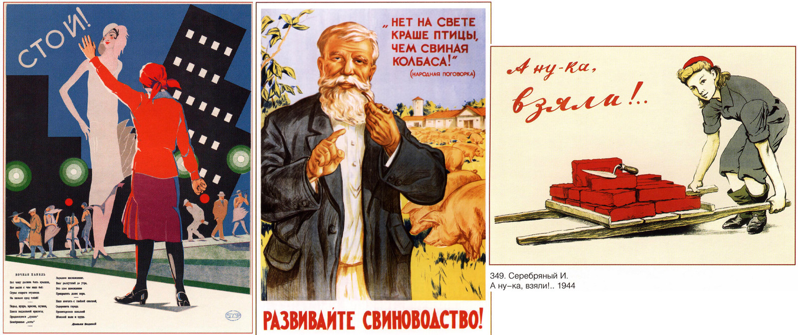
There were many different posters in the USSR. They fulfilled the tasks of advertising, propaganda, education, etc. But among the rather boring and monotonous artwork there were real “masterpieces”, whose authors approached their creation with humor and imagination, or chose a topic completely unexpected, poorly dovetailing with the standard Soviet concepts of decent and acceptable. We will talk about the most unusual posters of the USSR in this article.
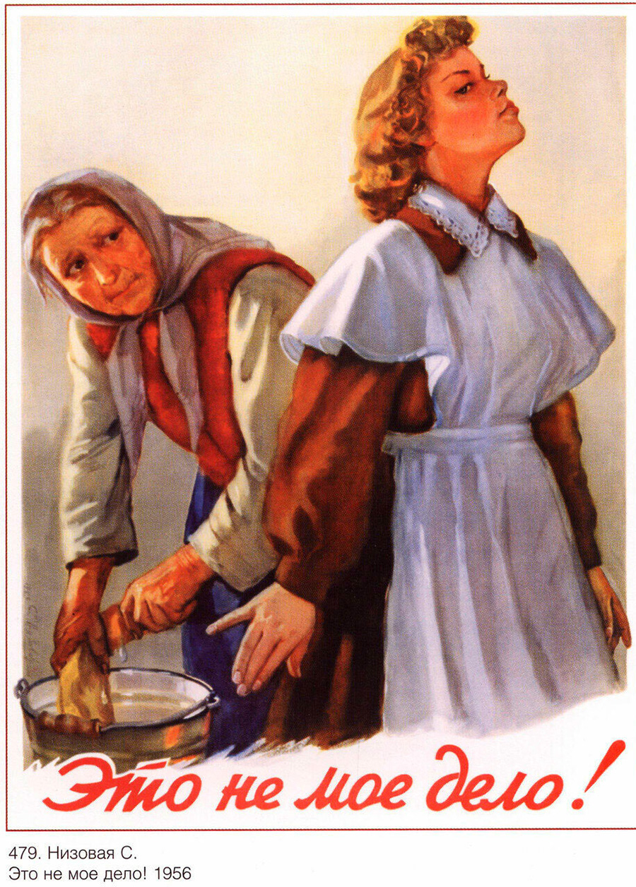
It's none of my business! 1956, Nizovaya
For example, the poster “It's none of my business”, drawn by artist S. Nizova in the standard style of the 1950s, when simple lines and clear forms of post-revolutionary modernist and avant-garde posters gave way to detailed artwork reminiscent of ordinary paintings in the direction of socialist realism. There, a high school girl clearly does not want to tie her life to tedious artwork, which the poster's author strongly rejects. Perhaps the case is taken from the artist's life, and it is a mother's resentment at her lazy and disobedient daughter. In Soviet times, such behavior was out of the ordinary, a young wife who does not want and can not do housework, no one needs, simply because this artwork except for her no one to do.
And what can lead to such a desire to live easily and simply shows the poster “Stop! Night panel”.
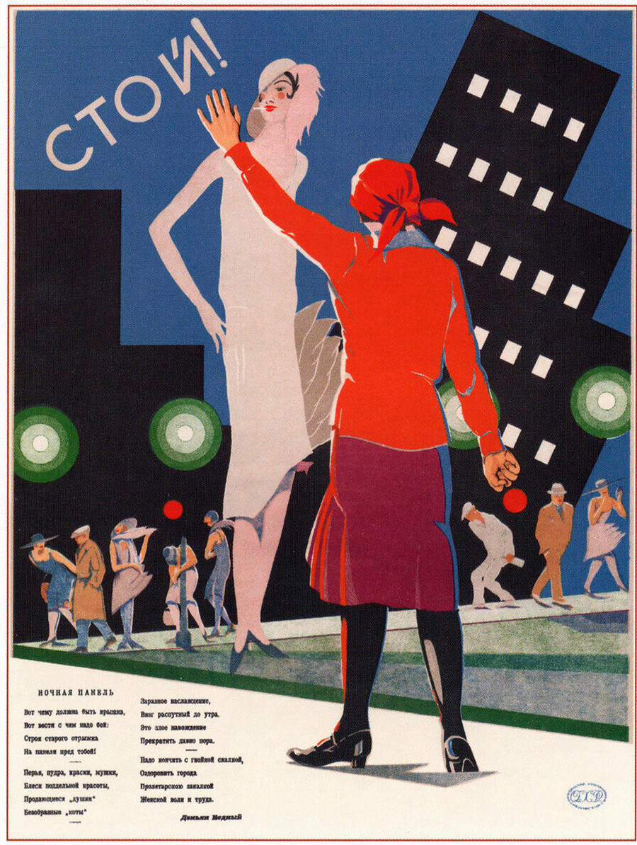
Stop! Night panel
It is dedicated to the proliferation of “night butterflies” during the NEP, when young pretty girls, out of need or just a desire to live life to the fullest, rather than work at a tedious and hard “normal” artwork, were looking for wealthy clients at night. Demand and opportunity breeds supply, and Soviet officials had nothing to do but order such posters and stigmatize such “bourgeois vices” in every possible way. Not always, however, this was successful.
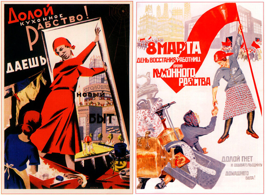
Down with kitchen slavery
Soviet posters were often drawn according to a certain scheme - a lot of red, blue and white color, expressive lines, some stylization of the image. True masters of the poster even from simple and banal topics managed to create something interesting, originally built the composition, put in them unbridled optimism and steady movement towards a happy future.
And do not think that the Soviet posters were only calling or stigmatizing, there were many educational posters on a variety of topics, and it was they were issued in the largest circulation. “Don't talk”, “Don't get in or you'll get killed”, “Tie yourself down when doing artwork on steep roofs”, which clearly depicts what disregard for such safety measures can lead to.
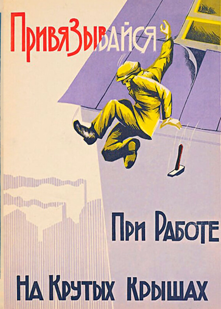
Get attached when doing artwork on steep roofs
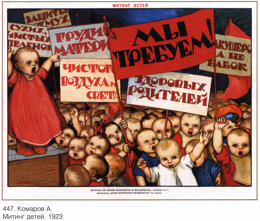
Sometimes the artists really did originalize, like this “Children's Rally” poster. Honestly, I wouldn't want to actually see it, and it's not about the children's demands, it's about the rally itself, which feels like an episode from a horror movie or surrealist dystopia.
Famous poets, in particular Vladimir Mayakovsky, contributed their bright heads to the creation of posters. He often collaborated with the famous ROSTA Windows, and composed various poems for them, succinct and concise, not in the eyebrow, but in the eye.
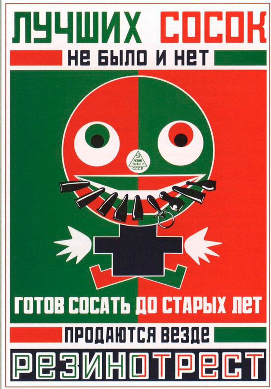
Advertisement for Rubber Trust
By the way, no one noticed any vulgar meaning in this verse at the time, and the poster was even awarded second place at the International Exhibition of Decorative Arts in Paris.
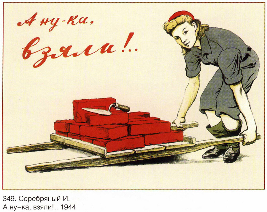
And this poster is already partly reminiscent of pin-up, only not so tied to the sexuality of the girl. But you really want to take and then escort such an enterprising worker home or ask her out on a date.
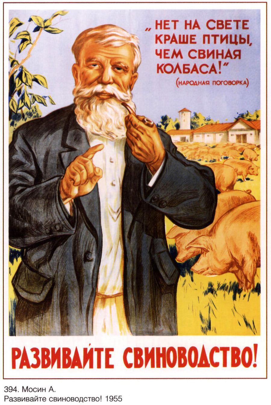
And Soviet posters were also humorous, but very rarely, and only on domestic and agricultural topics. And indeed, no one would trade real pork sausage for chicken sausage even then, much less now.
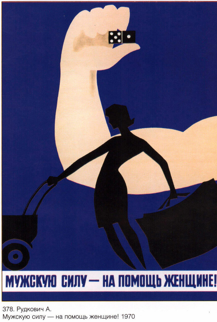
Men's power to help women! 1970, Rudkovich
Thanks to modern advertising of all sorts of remedies for impotence, male strength is associated with understandable things. But in 1970, the artist Rudkovich meant male strength in its original meaning - men are simply stronger than women and should help them carry heavy bags and in general, replace them at heavy artwork. It is a pity that this poster has remained unheeded.
Buy handmade goods or modern art you can on artAlebrio - is an international marketplace for people who want to create, sell, buy and collect unique items and art - buy the best with us artAlebrio.com.
By confirming your order you unconditionally accept these General Conditions of Sale